Create Animated Google Loader in HTML & CSS
Loading animation is a visual indicator that is used to inform the user that a process is occurring in the background, such as data being loaded or a task is completed. Loading animations are commonly used in web and mobile applications, and can be created using a variety of programming languages and tools.
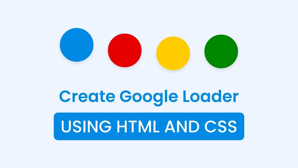
Have a look at the given image of our loading animation. As you can see, it features four circles of different colors that start moving up and down in an irregular pattern upon page load.
Today in this blog you will learn how to create an engaging and interactive loading animation that is used by Google. Whether you are a beginner or an experienced developer, creating a loading animation using HTML and CSS is a skill that is definitely worth learning.
Have a look at the given image of our loading animation. As you can see, it features four circles of different colors that start moving up and down in an irregular pattern upon page load.
Animated Google Loader in HTML & CSS [Source Code]
To build a Drawing App using HTML CSS & JavaScript, follow the given steps line by line:
1. Create a folder. You can name this folder whatever you want, and inside this folder, create the mentioned files.
2. Create an index.html file. The file name must be index and its extension .html
3. Create a style.css file. The file name must be style and its extension .css
4. Create a script.js file. The file name must be script and its extension .js
First, paste the following codes into your index.html file.
<!-- Coding By CodingNepal - codingnepalweb.com -->
<meta http-equiv="X-UA-Compatible" content="IE=edge" />
<meta name="viewport" content="width=device-width, initial-scale=1.0" />
<title>Google Loader in HTML & CSS</title>
<link rel="stylesheet" href="style.css" />
<span class="dot"></span>
<span class="dot"></span>
<span class="dot"></span>
<span class="dot"></span>
<!DOCTYPE html>
<!-- Coding By CodingNepal - codingnepalweb.com -->
<html lang="en">
<head>
<meta charset="UTF-8" />
<meta http-equiv="X-UA-Compatible" content="IE=edge" />
<meta name="viewport" content="width=device-width, initial-scale=1.0" />
<title>Google Loader in HTML & CSS</title>
<link rel="stylesheet" href="style.css" />
</head>
<body>
<div class="wrapper">
<span class="dot"></span>
<span class="dot"></span>
<span class="dot"></span>
<span class="dot"></span>
</div>
</body>
</html>
Second, paste the following codes into your style.css file
box-shadow: 0 5px 10px rgba(0, 0, 0, 0.1);
animation: animate 1s ease-in-out infinite alternate;
transform: translateY(-10px);
transform: translateY(5px);
* {
margin: 0;
padding: 0;
box-sizing: border-box;
}
body {
display: flex;
height: 100vh;
align-items: center;
justify-content: center;
background: #eef5fe;
}
.wrapper {
display: flex;
column-gap: 10px;
}
.wrapper .dot {
height: 20px;
width: 20px;
border-radius: 50%;
background: #008ae6;
box-shadow: 0 5px 10px rgba(0, 0, 0, 0.1);
animation: animate 1s ease-in-out infinite alternate;
}
.dot:nth-child(1) {
animation-delay: -0.25s;
}
.dot:nth-child(2) {
background: #e60000;
animation-delay: -0.5s;
}
.dot:nth-child(3) {
background: #ffcc00;
animation-delay: -0.75s;
}
.dot:nth-child(4) {
background: #008800;
animation-delay: -1s;
}
@keyframes animate {
0% {
transform: translateY(-10px);
}
100% {
transform: translateY(5px);
}
}
That’s all, now you’ve successfully created a project on Animated Google Loader in HTML & CSS. If your code doesn’t work or you’ve faced any problems, please download the source code files from the given download button. It’s free and a zip file containing the project folder with source code files will be downloaded.