• ;
  • A Coding Boy
  • Blog
  • Videos
  • Projects
  • Home
HTML AND CSS
LOGIN PAGE
WEBSITE DESGIN
API PROJECTS
CARD DESGIN
JAVASCRIPTS GAMES
JAVASCRIPT PROJECTS
JAVA PROJECTS
PYTHON PROJECTS
demo post
only for demo nasa prospect
only for demo the gonnies
most popular
how to create parallax website
how to create a beautiful card
how to create a netflix login page
how to create flipping ui card
how to create image generator website
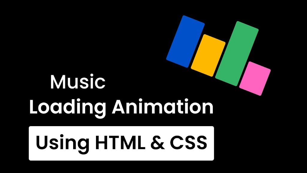
Create a Music Loading Animation in HTML & CSS
As users, we’re all too familiar with the dreaded loading screen. Whether it’s waiting for a website to load or a mobile app to start up, it can be frustrating to stare at a static or spinning progress bar. However, there is a way to make this experience more enjoyable for your users – by incorporating a musical loading animation.
] A musical loading animation is a creative way to add a fun and interactive element to your user interface. It can be as simple as a progress bar that changes color or shape in time with the music, or as complex as a full-fledged animation that tells a story while the user waits.
Steps To Create a Music Loading Animation
To build Music Loading Animation using HTML CSS & , follow the given steps line by line:
1. Create a folder. You can name this folder whatever you want, and inside this folder, create the mentioned files.
2. Create an index.html file. The file name must be index and its extension .html
3. Create a style.css file. The file name must be style and its extension .css
4. Create a script.js file. The file name must be script and its extension .js
First, paste the following codes into your index.html file.
Plain text
Copy to clipboard
Open in new window
EnlighterJS 3 Syntax Highlighter
<!DOCTYPE html>
<!-- Coding By CodingNepal - codingnepalweb.com -->
<html lang="en">
<head>
<meta charset="UTF-8">
<meta name="viewport" content="width=device-width, initial-scale=1.0">
<meta http-equiv="X-UA-Compatible" content="ie=edge">
<title>Music Loading Animation</title>
<!---Custom CSS File--->
<link rel="stylesheet" href="style.css">
</head>
<body>
<div class="animation">
<span></span>
<span></span>
<span></span>
<span></span>
<span></span>
</div>
</body>
</html>
Copy Codes
<!DOCTYPE html> <!-- Coding By CodingNepal - codingnepalweb.com --> <html lang="en"> <head> <meta charset="UTF-8"> <meta name="viewport" content="width=device-width, initial-scale=1.0"> <meta http-equiv="X-UA-Compatible" content="ie=edge"> <title>Music Loading Animation</title> <!---Custom CSS File---> <link rel="stylesheet" href="style.css"> </head> <body> <div class="animation"> <span></span> <span></span> <span></span> <span></span> <span></span> </div> </body> </html> Copy Codes
Second, paste the following codes into your style.css file
Plain text
Copy to clipboard
Open in new window
EnlighterJS 3 Syntax Highlighter
/* Import Google font - Poppins */
@import url('https://fonts.googleapis.com/css2?family=Poppins:wght@200;300;400;500;600;700&display=swap');
*{
margin: 0;
padding: 0;
box-sizing: border-box;
font-family: 'Poppins', sans-serif;
}
body{
min-height: 100vh;
display: flex;
align-items: center;
justify-content: center;
background-color: #000;
}
.animation{
height: 95px;
display: flex;
transform: rotate(180deg);
}
.animation span{
width: 38px;
margin: 0 2px;
border-radius: 6px;
/* background-color: #fff; */
animation: loader 2s infinite;
}
@keyframes loader{
0%, 100%{
height: 15px;
background: #0081C9;
}
25%{
height: 95px;
background: #FFB100;
}
50%{
height: 50px;
background: #54B435;
}
75%{
height: 95px;
background: #FF6464;
}
}
.animation span:nth-child(1){
animation-delay: .2s;
}
.animation span:nth-child(2){
animation-delay: .4s;
}
.animation span:nth-child(3){
animation-delay: .6s;
}
.animation span:nth-child(4){
animation-delay: .8s;
}
.animation span:nth-child(5){
animation-delay: 1s;
}
/* Import Google font - Poppins */ @import url('https://fonts.googleapis.com/css2?family=Poppins:wght@200;300;400;500;600;700&display=swap'); *{ margin: 0; padding: 0; box-sizing: border-box; font-family: 'Poppins', sans-serif; } body{ min-height: 100vh; display: flex; align-items: center; justify-content: center; background-color: #000; } .animation{ height: 95px; display: flex; transform: rotate(180deg); } .animation span{ width: 38px; margin: 0 2px; border-radius: 6px; /* background-color: #fff; */ animation: loader 2s infinite; } @keyframes loader{ 0%, 100%{ height: 15px; background: #0081C9; } 25%{ height: 95px; background: #FFB100; } 50%{ height: 50px; background: #54B435; } 75%{ height: 95px; background: #FF6464; } } .animation span:nth-child(1){ animation-delay: .2s; } .animation span:nth-child(2){ animation-delay: .4s; } .animation span:nth-child(3){ animation-delay: .6s; } .animation span:nth-child(4){ animation-delay: .8s; } .animation span:nth-child(5){ animation-delay: 1s; }
Conclusions and Final Words
By following the steps you have successfully created a Music Loading Animation. There are lots of CSS animations you can find on this website to enhance your skills in HTML & CSS.
If you found this blog helpful, please consider sharing it with others. Your support helps us continue creating valuable content and resources for the development community. Thank you for your support!
live demo
Download files
Info
Home
Projects
Blogs
Videos
About us
Follow us for more!
© 2023 All Rights Reserved A Coding Boy

<!DOCTYPE html> <html> <head> <meta charset="UTF-8"> <meta name="viewport" content="width=device-width, initial-scale=1.0"> <title>Glassmorphism Login Form | CodingNepal</title> <link rel="stylesheet" href="style.css"> </head> <body> <div class="wrapper"> <form action="#"> <h2>Login</h2> <div class="input-field"> <input type="text" required> <label>Enter your email</label> </div> <div class="input-field"> <input type="password" required> <label>Enter your password</label> </div> <div class="forget"> <label for="remember"> <input type="checkbox" id="remember"> <p>Remember me</p> </label> <a href="#">Forgot password?</a> </div> <button type="submit">Log In</button> <div class="register"> <p>Don't have an account? <a href="#">Register</a></p> </div> </form> </div> </body> </html>

@import url("https://fonts.googleapis.com/css2?family=Open+Sans:wght@200;300;400;500;600;700&display=swap"); * { margin: 0; padding: 0; box-sizing: border-box; font-family: "Open Sans", sans-serif; } body { display: flex; align-items: center; justify-content: center; min-height: 100vh; width: 100%; padding: 0 10px; } body::before { content: ""; position: absolute; width: 100%; height: 100%; background: url("https://www.codingnepalweb.com/demos/create-glassmorphism-login-form-html-css/hero-bg.jpg"), #000; background-position: center; background-size: cover; } .wrapper { width: 400px; border-radius: 8px; padding: 30px; text-align: center; border: 1px solid rgba(255, 255, 255, 0.5); backdrop-filter: blur(9px); -webkit-backdrop-filter: blur(9px); } form { display: flex; flex-direction: column; } h2 { font-size: 2rem; margin-bottom: 20px; color: #fff; } .input-field { position: relative; border-bottom: 2px solid #ccc; margin: 15px 0; } .input-field label { position: absolute; top: 50%; left: 0; transform: translateY(-50%); color: #fff; font-size: 16px; pointer-events: none; transition: 0.15s ease; } .input-field input { width: 100%; height: 40px; background: transparent; border: none; outline: none; font-size: 16px; color: #fff; } .input-field input:focus~label, .input-field input:valid~label { font-size: 0.8rem; top: 10px; transform: translateY(-120%); } .forget { display: flex; align-items: center; justify-content: space-between; margin: 25px 0 35px 0; color: #fff; } #remember { accent-color: #fff; } .forget label { display: flex; align-items: center; } .forget label p { margin-left: 8px; } .wrapper a { color: #efefef; text-decoration: none; } .wrapper a:hover { text-decoration: underline; } button { background: #fff; color: #000; font-weight: 600; border: none; padding: 12px 20px; cursor: pointer; border-radius: 3px; font-size: 16px; border: 2px solid transparent; transition: 0.3s ease; } button:hover { color: #fff; border-color: #fff; background: rgba(255, 255, 255, 0.15); } .register { text-align: center; margin-top: 30px; color: #fff;}